Studio culture curated by

Volume
15—
May 7, 2014 / Greg
Testing the Concept: Aerie Part II
Pop-Up Prototype.
The growing trend of ‘popping up’ affords brands, both established and start-up alike, the opportunity to set up shop in a vacant space provisionally as a means to draw relevance, stir up buzz and test new products and/or locations. They’re built up in a day or two and sometimes broken down just as quick. They live in a limited window and as such, embrace a makeshift aesthetic where a part of the charm is derived from it all feeling like one big handmade installation – and there’s something inherently quirky and fun about them that felt right for Aerie.
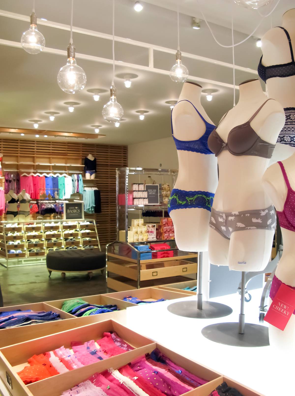
The product line is bold and what we proposed as a backdrop was a deliberately quiet canvas with a soft palette that takes a step back and lets the merchandise do all the talking. Warm tones and natural surfaces and textures seemed like the appropriate counterpart to contrast the vibrant colors and fabrics. The stark walls and ceiling of the host space serve as a clean, white box, putting emphasis on the materials and textures contained within. Continuous natural birch flooring adds a warmth to the entire space while highlight areas are marked simply with white floor paint. The sales area is flanked by rows of wall-mounted, dovetailed wood boxes that shoulder most of the product count while newly-designed floor fixtures serve as shoppable centerpieces throughout. The trellis surround from the storefront we talked about in Vol 013- is carried inward and reused as both a textural backdrop and a merchandizing wall to cap the rear of the store. A continuous painted band in the signature Aerie gray runs the entire perimeter, across shell and fixtures alike, tying it all together. We wanted it all to feel loose.
The prototyping process certainly helped in honing that look and we had the opportunity to assess every inch, but testing the look and feel of a material is one thing. Testing the look and feel of a user experience, especially a new one, is another. A cornerstone goal behind the redesign was to promote a more one-on-one “concierge” experience for the consumer. Our intentions were to keep the shopper in close quarters with the staff and ensure an attendant is always close-by and on-call during fitting. On paper, the cash wrap and fitting rooms were tied into one, unified service area. Housing all services under one continuous wood post-and-beam cabana-style structure essentially meant that size consultation, fitting (and re-fitting) and check-out would now all happen in the same place.
With the functional prototype, we were placed in the shopper’s shoes and could see what it was like to shop the store, locate sizes, sit for a consultation, use the fitting rooms, and check out. We could survey what worked, what felt comfortable and what needed revision. There are clear aesthetic and experiential benefits in being able to prototype and assess every step of the store design and through 3 rounds of it we were able to gauge reactions, make tweaks, and deliver a user experience that we knew would make the final concept a success.